Tuesday, 31 January 2017
VIKI
I think the second book cover is better than the first. because, the second use the colours shape to demonstrate more details although the image is very simple. then the first book cover is not stronger to attach the consumer and don't involve logo, authors and bar code.
LOUISE
wow,I relay like this book cover, because the cover include a lot of elements ,for example the traditional clothes, the old poster and old printer then you use cucoloris to design the front cover.
DORIS
Maybe you need to say what age is this book suitable for consumers ,as a student I don't want to buy . because the front cover is very crowd I can't find out the title when I take the book , I suggest you emphasize the title and reduce some elements , maybe that can help to improve the design , love you.
LEXI
The album cover is very interesting and the colour is very strong , because I can see it at first glance when I shopping . But if you improve the title I think that will become best seller album.
MAILE
I think the front cover, spine and first need to have contact , you use different elements to design this . and the impotent thing is you need print a whole book cover , not a part of cover ,because that can help us to understand your idea .
ZACHARY
The album cover is very nice but I think you need do spent more time to design the title and others .look forward to you next work .
Monday, 30 January 2017
Design of book cover
💛Book Cover💛
I research this image to decorate my cover book.
https://www.we-heart.com/2015/12/18/nocs-atelier-seconds-watch/
I use the Photoshop to design .
I finished the book cover last weekend, but when i show my design for my friends, they said the color is dark. And also the teacher provided to me some advice that if you want to make the cover clear and attractive, you need make some elements strong, such as, the font color, the different shape and so on.
I have to listen and accept others suggest to correct my book cover.
I use the a lot of orange to catch the reader's eyes and put the element on the same level . Then the book cove's size is 13cm x 13cm x 6cm and the material is self-cover.
Final design
Tuesday, 17 January 2017
packaging of pizza hut
First, I have three different ideas , for example , pizza, rice and KFC. Finally, I decide to design
the packaging of pizza and chose the PIZZA HUT .Because, in the UK , plenty of students and
residents always eat fast food , such as pizza when they have relax time. And PIZZA HUT is
popular in the different countries.
(sketchbook)
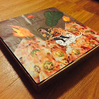
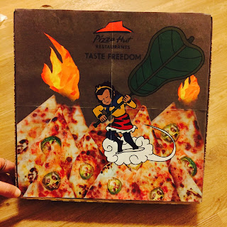
Second, I use the Photoshop to draw the packaging . My inspiration is from 'journey to the west'
that is one of four great classical novels and depicts traditional Chinese mythology. In addition , I
chose a plot that describe this place has fire, the four people can not through the mountain.
Because , the mountain is very hot and the Sun wukong can not put out the fire , he must asked to
borrow a fan from princess. The reason for only this fan can put out the fire and help they through
the mountain .
Third, I use the pizza to instead of mountain and have some fire mean the pizza is very spicy.
The most important is the consume can collect the cartoon monkey to decorate their room.
I print the picture and put it in the pizza box
That all of my design
THANK YOU :)
Saturday, 14 January 2017
research about pizza hut - homework
pizza hut
Hello!
Today, we ate two pizzas in pizza hut.
And we wrote some sketch in the tissue when we were waiting for pizzas.
The pasta is very nice! :)
Viki 's idea
Mavis's idea
we got two boxes , so luck!
Then , we went to a relax zone which is locate in the high cross to take some pictures .
In addition , we use the pizza to made some different shapes or images , because, we want to use those images to design the packaging .
inspiration
our inspiration are come from the Chinese story ,named monkey king. The story is very famous in my country and that have a lot of chapters approximate eighty one chapters. Then we chose two plots to design the packaging . For example , one of the plot is the monkey king was under a fiver finger mountain and the other one is talk about the monkey king want to put out the fire mountain . And I am responsible the second one.
five finger mountain
fire mountain
https://www.youtube.com/watch?v=-FJEw2ELtH0&list=PLItPK6HSqeSw1g24tuocVl8tLS7G6XViS&index=35 14/01/17
we will use Photoshop to draw the packaging in the next day .
packsging design
packaging design of pizza box
we (Viki and I ) will design packaging box .first, we need choose a pizza brand, for research Pizza Hut , Domino boxes.
So we will go to pizza hut restaurants o research the normal packaging box.
Tuesday, 10 January 2017
introduction
A LITTE BIT ABOUT ME
My name is Mavis .
In my university , my major is industrial design and I studied in toy design .
I will be study in innovation design and I am interested in footwear design .
In this blog I will be describe my sketchbook and process of my portfolio .
Subscribe to:
Comments (Atom)


