In the class, I have a tutorial and I obtained a lot of useful suggestion. Thus, this week I need to improve my website basis on these suggestion.
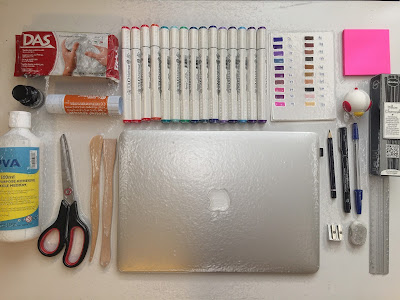
first, the background is vague concept and not reflect my major. maybe I can use my best work or some tools as my background, like sketch, 3D model or pencil. I select some tools which are relate my major and orgarnize this to took a photo, then i used Photoshop to do some texture, like add a plastic cover. Moreover, add this photograph on my website, however I think the old logo is not good and the colour and style is not suitable for this new background.
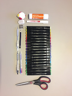
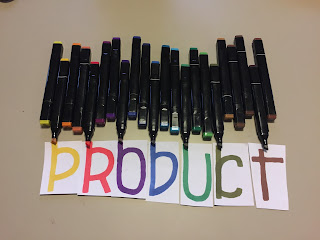
Second, I try to make another one use different mark pen. And then I use Photoshop to design the last one.
I think this background is better, and also i change my logo design , just use white color and impact font to make and add a line under the word.


No comments:
Post a Comment