Monday, 27 February 2017

BLOG BUDDY


BLOG     BUDDY


                                                                            👇


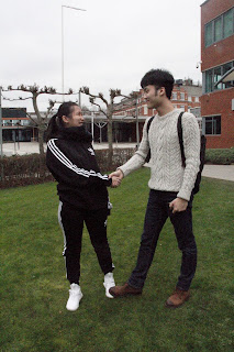
She name is LEXI,  actually , she always give some positive advice when i have some issues.

In the course of further, she will improver the design skills with me , for example, we will read each other's blog and give some positive or negative and how to improve these.


Thursday, 23 February 2017

Reflect


Reflect(poster)

Yesterday, i had a presentation in the Philip Tasker Building. Firstly, i told about my design in three steps; for example, described my inspiration, sketch,reference and final design. Secondly , the totur and classmates give some advices.

Strengths👍
  1.  Good explaining of the example of other.
  2.  I have the ability to use software to design poster. 
  3. Clear idea
Weakness👎
  1. One of the poster a little bit dark.
  2. Presentation should be more confidence and loud of speaking
  3. Add some research about shoe poster.
  4. A lot of pictures is not good , waste some time to take photos.
  5. Spelling mistake.
Improve💪

  1. Research more detail when i design a product or other things.
  2. Check the grammar and spelling.
  3. Learn how to use the camera to take a best picture.
  4. I will speak up when i have presentation.
  5. And i will change the product's size , because its not big in the poster. in addition , i am going to reflect my research when i designing.
  6. I wii edit the first poster,for example, the light rectangle is in the middle, i will put the light area between the top left corner and lower right corner.This can be contected with the product icon.


Wednesday, 22 February 2017

feedback


Doris 

strength: i think the logo's meaning is good, because the simple logo can show the company content and slogan.
weakness: the three posters use some pictures.
suggestion:i think you should use different image to design the different poster, and also give more ideas.


Zachary

strength: you have a lot of research of your project.
weakness: the ideas are general and simple. just poster , you don't have digital advertising or different size.
suggestion:if you have time , you should try to use software for practice. 


Tuesday, 21 February 2017

presentation feedback

Miles
strengthening: miles uses the elements to replace the present, I think this idea is very interesting.
 weakness :miles needs to design different size.


Louis
strengthening: she use the questionnaire to got some information about customer and market.
weakness : I think she is not proficient in Photoshop.


LEXI
strengthening: the theme is interesting and the blog include many information and details. she  also good at photography.
weakness : don't have logo and slogan in the poster.


Viki
strengthening: she drew a lot of sketches before design .
weakness :I can't see the slogan in the poster , you can change its colour and make more stronger.


Monday, 20 February 2017


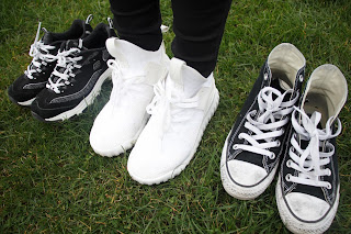
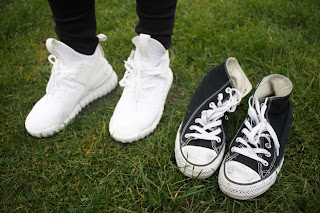
  1. I chose two different places, one is the grass, one is the mud.
  2. I try to use different angles to show the shoes which use this product and do not use this product.
  3. These three pairs are my own shoes.


I chose a part of photos which has higher definition and better composition then use photoshop to design a poster.


the shoes is very dirty , and in the middle of the poster I use a rectangle to show different information.The inside of the shoes is very clean, this is because its use of spray to protect shoes.
I think contrast is obvious between the clean and dirty.
thus this is a A3 size poster, so i put this in the shoes store's window or wall.


this is a A5 size leave card, you can take this card when you shopping .
i use the grass photo to make a card, because , the colour is dynamic and is comfortable .


this is an airport adverting, i use the mud background , because the airport is very light and roomy, so the dark colour is ok . in addition , this adverting shows that if you walk in the mud or dirty road, don't worry, you can use spray to protect your shoes and keep its clean or white.


poster


I will design three different size to show my idea.
In the class, the teacher looked at my ideas and sketches and discussed with me what size was right for me. in addition , told me the problems of poster and how to improve or solve it.

so, i chose the A3 poster, airport adversing and brochure.

first i need to take some photos to help me to design poster.
in Saturday , i took pictures with lexi, but i do not know how to use the camera, so i got many bad images, so sad.


the photos are not clear and have some noisy point. I am not satisfied with this photography, so i found lexi, and I took photo again with lexi in sunday. actually, she give a lot of useful suggests of how to use the camera. thanks for your help.


LOGO AND SLOGAN

I am going to design a logo and slogan of my product.
first, i need to understand some information about my product .
  1.  this product is a spray 
  2. this product can protect your shoes and keep your shoes clean.
so, i need to emphasize the function use a word, that is 'clean'. because I want to use the most direct way to express the function of my product. This series of products are use dark colours, so I also continue to use this colours to design a logo.


now, i use the photoshop to design a logo.
  1. I built a circular selection and then filled the black.
  2.  I built a rectangle selection and  delete it.
  3. I write a word and use two colors to design , because i want to say the write word in the black area that is mean 'clean '


this is my final design .
and I replaced the original logo .


the first i designed the slogan was ' never dirty ', but the teacher this is negative, and the teacher suggest me to change. thus i use ' keep your shoes clean ' as my slogan .


Monday, 13 February 2017

ABOUT POSTER

i will use poster to show my idea 

first,  i research some good advertisement 

I think this is kitchen paper's adverting. there was drain on the table when the coffee was sprinkled on the table, the drain representative the 'poly ' and show the paper is very absorbent.


this is a poster about band-aid, this poster is show the band-aid's function that is waterproof
.because the tears flow around the bandits. i thik this idea is very interesting and clear to demonstrate the function.
this poster shows that the carton child The child broke his chin when he was riding a bike,but he was lucky because she hit a medicine box. The appearance of this medicine box is very consistent with the theme.
i really like this product , because This poster is very funny to express the role of this product. for example, the spray like flyswatter and use the adhesive tape’s texture to describe the product.then the fly can not move just stay in a corner , if the fly moving its will die .


http://www.fromupnorth.com/creative-advertising-523/?utm_content=bufferd712b&utm_medium=social&utm_source=pinterest.com&utm_campaign=buffer    


conclusion 
these are put logo in the lower right corner and put the image of product. i think that can help custmers to understand the meaning . in addition , the poster also use very simple things to demonstrate the function , it is very clearly. and the important thing is the poster can attract customer's attention while let to customer look more time to know more details. for example , why the designer use this method to make this poster and  what is the function is better than other product.
so , the poster need to obvious and easily to understand.


this is my sketch , i have three ideas. then i research some images and cut these to show my idea

first , i use the high contrast to show the product 
 and chose five shoes and the four shoes are dirty , only the white shoes is clear because that use the protect shoes's product. 
second, when the people step on my shoes i will anger , because my shoes is very cleaner , you will get my shoes dirty. but if i use a product to protect my shoes i will do not worry, so the poster shows two people are handshake and keep smile .
third, the shoes print is mean the people is walking in muddy water and  the shoes is keep clear , so the product is good at remove the water.
that are my all of idea . then i will take  a photo use camera and Photoshop to design my final poster.

THINKING


First, I will think about five  steps :


who
what
how
why
when


Who will use this product?
Actually , I think everyone can use that , because of  everyone need wear the shoes and periodically clean. And the child, student and busy people are relay need this product , because the child does not know any better, so they don not protect their shoes while the students are absorbed in study , so they don not have enough time to clean their shoes whilst the busy people has same reason.


What shoe can use this product ?
A majority of shoes which absorb water can use this product . for example ,sneaker, canvas, frizzled shoes, snow boot and so on , just without leather shoes .


How to use this product?
when you spray your shoes with this product, you want to hold the canister 20com away from your shoes, and spray a single layer all over.do not be too heavy with the spray and drench your shoes-that is not going to help or protect it more. now just leave it to dry. in addition, this protect spray lasts for up to 4 week, so we suggest around 3 to 4 weeks after initial treatment, you top up your shoes with a single coating.(ref:  http://www.crepprotect.com/science/the-spray/ 13/02/17 )

Why the people need to buy this product?
This product can help mother reduce housework, because the child often put ketchup, ink or some
liquid which is  difficult to clean. moreover, the students and busy people need go to school or company everyday , including raining. When the weather is terrible , the road will have a lot of soil and dirty water. thus they do not have enough time to clean , maybe they will send their shoes to cleaning shop. so If the people use this product to protect their shoes, they will reduce the times of brush their shoes.

When to use this product?
Up to you , sunny day or raining day , because the you can remove the dirty water and soil when the weather is rain , then if the weather is good but you will encounter some bad things , for example , the coffee is sprinkle or classmate step on your feet, don't worry, even if this happens, this product can also protect your shoes.


SUMMARY

I use this product when I study in  the UK. I must to say the weather is terrible , always raining and my shoes will get dirty. But this product can avoid my shoes become dirty, I think that is very useful , so  I want to advertise this product which can protect my shoe.


Tuesday, 7 February 2017


  • inspiration  ⬊


after the lesson, I carefully thought about what products I want to chose to make a advertisement.

first, i want to chose the BRITA to design.


But, i don't have enough idea to make three advertisements. So, i change it to find other products.

Actually, i want to use some products which are i had, because, i used it so i know the product's advantage and what function is helpful and what function i can improve.

Then i find out the 'crep protect' in my room.


That product can protect your shoes keep clearly, original colour and also had waterproof layer.

Moreover, i want to change and redesign the logo. I use the original name 'crep' and add some elements which is relate the product. Such as, spray-head.


These are my drafts about the logo, include four ideas. However, i think these is not good,

 so i thinking again, and i just use the spray-head and the simple font. The most important 

is i will add the function in the logo, that is mean, the product can keep the shoe clear so i 

use the black font and  the spray-head squirt liquid to clean the black .  I use the white 

lines to show the product's effect for clean .


That is my first logo design and I use the Photoshop to design the logo.


Today, the teacher give me some useful advices, for example, i can redesign all of the

 design, like the logo, shape, packaging and so on . Then i can also improve the function , and 

this product have some advantage which is has attraction.


Conclusion 


I will improve these issues

  • change the product's name and keep the logo style , just change the name.
  • add some function , like size , packaging or colour.
  • use a slogan to advertise this product.