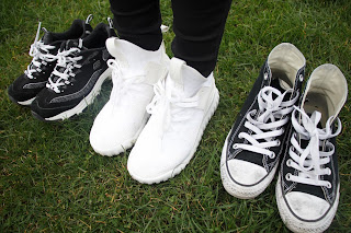
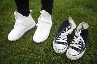
- I chose two different places, one is the grass, one is the mud.
- I try to use different angles to show the shoes which use this product and do not use this product.
- These three pairs are my own shoes.
I chose a part of photos which has higher definition and better composition then use photoshop to design a poster.
the shoes is very dirty , and in the middle of the poster I use a rectangle to show different information.The inside of the shoes is very clean, this is because its use of spray to protect shoes.
I think contrast is obvious between the clean and dirty.
thus this is a A3 size poster, so i put this in the shoes store's window or wall.
this is a A5 size leave card, you can take this card when you shopping .
i use the grass photo to make a card, because , the colour is dynamic and is comfortable .
this is an airport adverting, i use the mud background , because the airport is very light and roomy, so the dark colour is ok . in addition , this adverting shows that if you walk in the mud or dirty road, don't worry, you can use spray to protect your shoes and keep its clean or white.


No comments:
Post a Comment